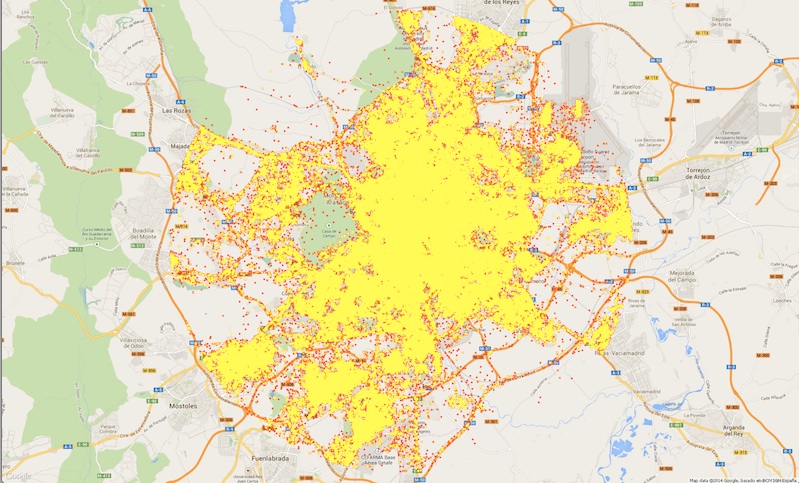
How do two million tweets look on a map?
We build people interest profiles based on any kind of location data, including geo-enabled tweets. This week I am going to share a mobile targeting use case locomizer did based entirely on tweets with location feature switched on. Ever wondered what will be the map look like if you put a dot for every geo-enabled tweet sent within a two-month period in a large city like Madrid? Well, that was what we did – we pinpointed the location of each and every tweet out of two million in order to build an interest heat map for Madrid. Stay tuned to learn about what kind of result we got from this trial. It will be posted this week.


